Brand Refresh
Strategy, made visible.
Overview
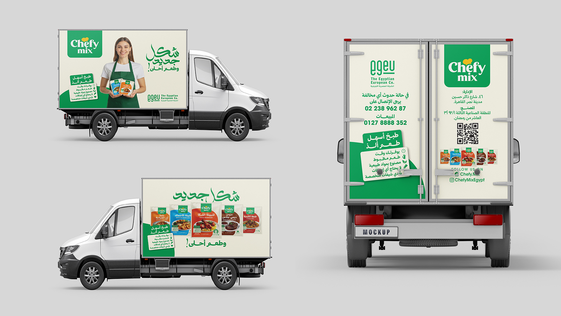
A complete identity built to last. The work began with strategy: a clear sense of who the brand is and where it's going. That thinking was then given a visual language confident enough to carry it everywhere. The result is a system that reads instantly across every surface, considered, consistent, and impossible to ignore.
The Challenge
Every brand arrives with the same quiet problem: it knows what it does, but not yet what it means. The work started there, interrogating the business until a position emerged that no competitor could borrow.
The Approach
Strategy set the rules; design made them visible. A single idea became a flexible system, then was stress-tested across every surface it would ever touch, from the smallest icon to the largest billboard.
The System
The outcome is a language, not a logo. Type, colour, motion, and tone all pull in one direction, giving the brand a presence that stays unmistakable even when the mark is nowhere in sight.
A brand isn't what it claims to be. It's what survives every place people meet it.